
For this next magic trick 😂, I am going to attempt to automate a marketing report. To do this, I’m using this Sales data from freeCodeCamp’s Github, which I’ve renamed Bikesales_data in this Spreadsheet, and I’ll be running this on Google Colab.

A little bit about Colab
Google Colab, short for Google Colaboratory is a free Jupyter (a powerful tool for interactively developing and presenting data science projects) notebook environment that runs on Google’s cloud servers, letting the user leverage backend hardware like GPUs and TPUs.
Colab allows you to write and execute Python in your browser, with zero configuration required, access to GPUs free of charge, and easy sharing.
Here goes!
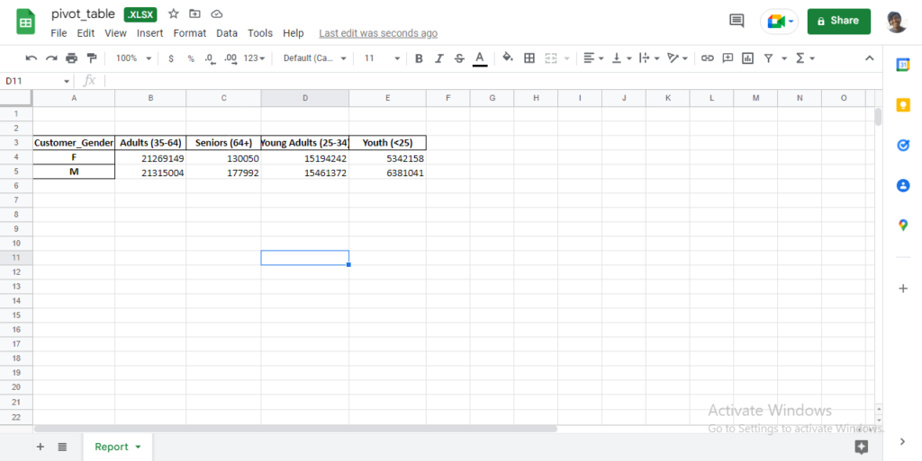
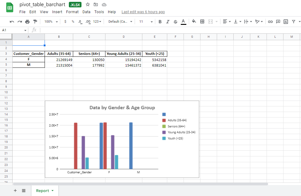
We want to look at how much revenue comes in by customer gender and age group, so we can know how to expand/focus our marketing efforts and initiatives.
Breakdown of terminologies by Data Independent.
Import = “Bring this functionality or library to my python script”
Pandas = The library you want to import, in this case, it’s pandas
As = The python nomenclature for creating as alias. This is a fancy way of taking a long word and referencing it as a short word
pd = The standard short name for referencing pandas
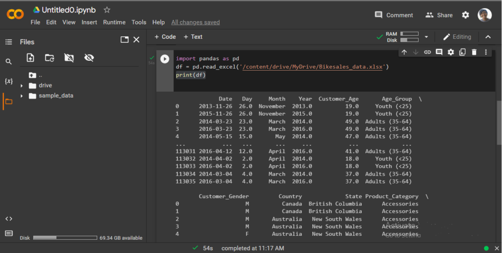
• then set the data frame variable to df.
• then print to see the data frame.
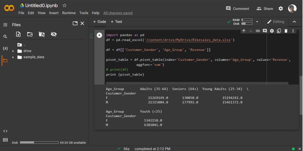
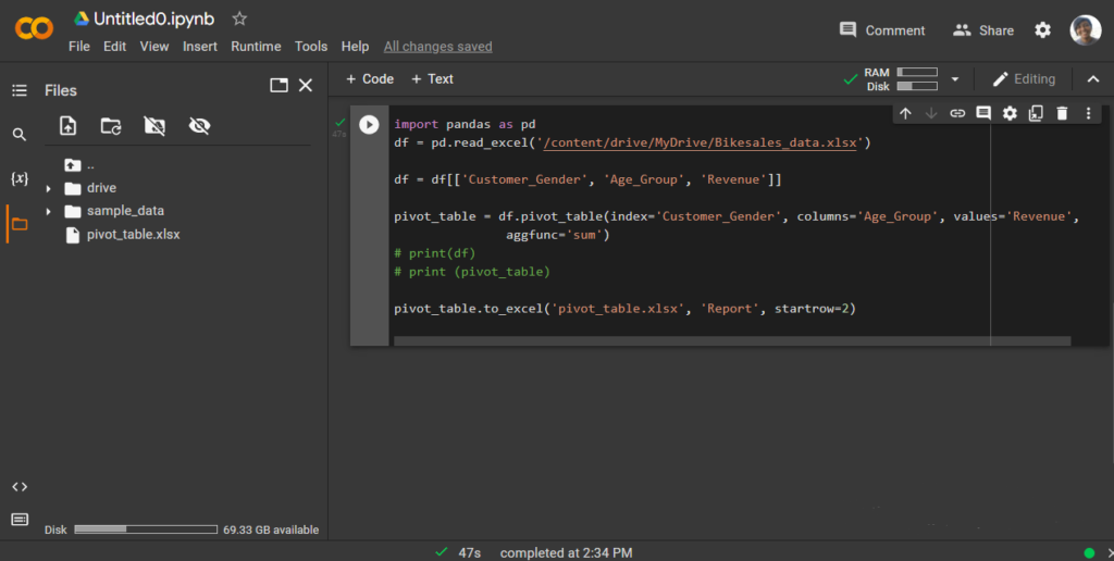
Next, is to create a Pivot table.
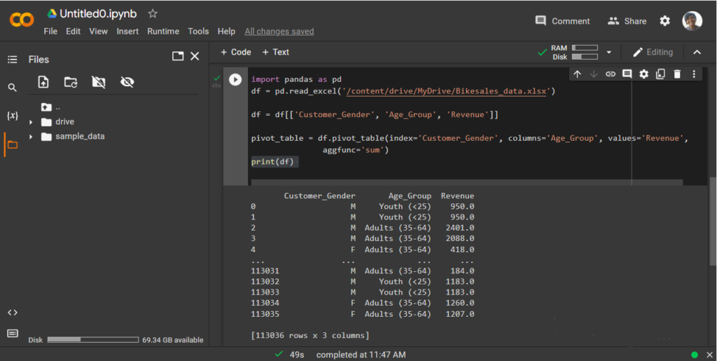
• to select: Customer_Gender’, ‘Age_Group’, ‘Revenue.
• now, we can set df to our selection.
• to continue with our pivot table we have to define which is the index, column, and values.
• remember our is to see how much revenue has come in through each gender, according to their age groups.
• after defining these three, we set the function we want, in this case, we want the sum.
Next, we export this pivot table into a spreadsheet (to a sheet named ‘Report”, so the report is clear and well visualised.
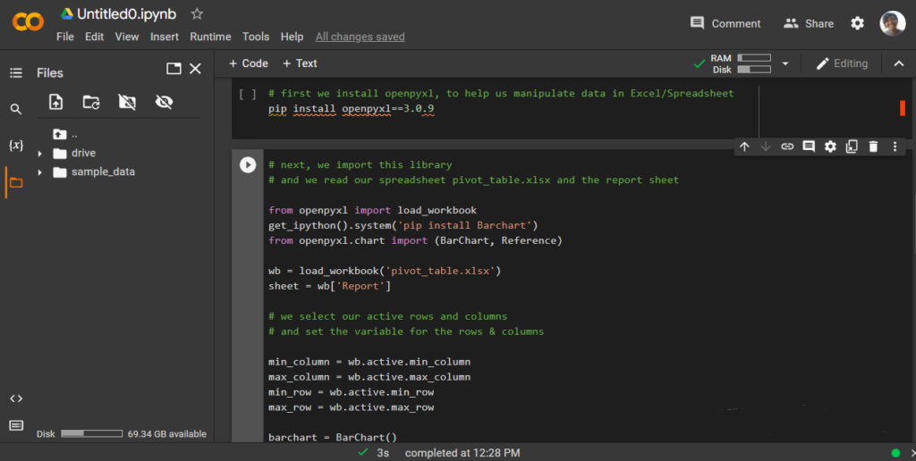
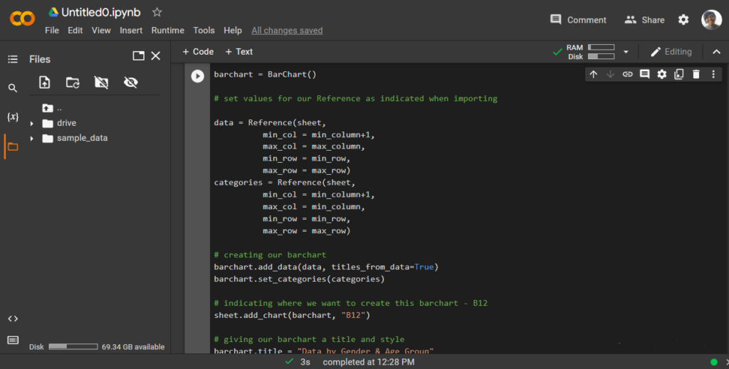
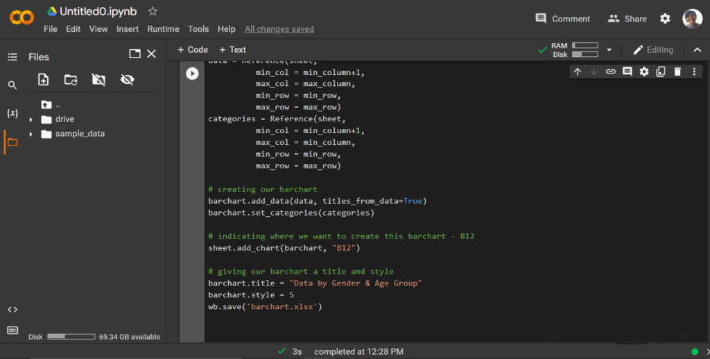
Creating a Barchart to visualize this.
To create a bar chart to effectively visualize this data result via python, see the breakdown:
Over to you. What types of marketing/sales data have you been working with lately? And what tools, methods, etc, have you been using to get the best out of those data?